There is a generation of consumers who will try a product they have never heard of, from a brand they know nothing about, just because they like the packaging...
According to Ad Age, 81% of Gen Z have tried a product because they liked the packaging design.
Gen Z – the cohort born between the late 1990s and early 2010s – is the first generation raised entirely in the digital age. They discovered brands on Instagram before they encountered them on a shelf. They share unboxing moments before they share reviews. They buy aesthetics as readily as they buy products. And they have developed a visual literacy that makes generic, category-conventional packaging not just unappealing – but invisible.

Creating packaging design for Gen Z is not about following a trend. It is about understanding a generation whose relationship with visual identity, authenticity, and self-expression is fundamentally different to every consumer group that came before them.
Here is what that means for packaging design...
The shelf is no longer the only sales channel
Before understanding what Gen Z packaging design looks like, it is worth understanding where it lives.
For previous generations, packaging was designed for a physical shelf – seen from two metres, for three seconds, under fluorescent light. For Gen Z, packaging is also a TikTok video, a fridge restocking reel, an unboxing moment shared with 50,000 followers, and a visual prop in a flat lay.
Trends like fridgescaping and restock videos highlight how visual appeal and perceived order offer comfort, creativity, and social shareability. The packaging that gets shared is the packaging that was designed to be worth sharing – whether or not the brand intended it.
This changes the brief entirely. When creating packaging design for Gen Z – it has to work on shelf, at thumbnail size on Amazon, and as a standalone visual object in someone else’s kitchen. The brands that understand this are designing for maximum impact in all of these environments.
Colour – bold, expressive, unapologetic
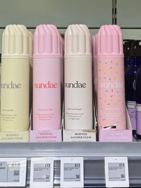
Millennial aesthetics gave us a decade of “millennial” pink, sage green, off-white, and the careful restraint of Scandinavian minimalism. Gen Z rejected the entire palette.
A rise in electrifying colour palettes, bubbly fonts, and stunning illustrations is continuing as the eclectic Gen Z aesthetic overtakes the subdued minimalist look preferred by Millennials.
Gen Z colour is not loud for the sake of it. It is expressive and specific – colours chosen for their emotional and cultural resonance rather than their category convention. Bright, saturated, unapologetic. The kind of colour that screams immediately and stands apart from every brand around it on a shelf.
Typography – personality-first, convention-last
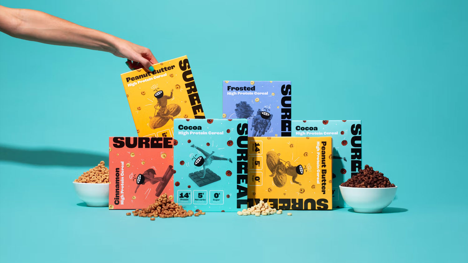
Gen Z typography is where the most significant category disruption is happening. The clean, neutral sans serifs that dominated consumer brand packaging for the past decade – communicating professionalism, approachability, and safe universality – are being displaced by fonts with genuine character.
Think retro typography, pixel art, and psychedelic type forms with sleek, futuristic details – creating a nostalgia meets imagination style that resonates with Gen Z’s love for the past while keeping brands relevant in today’s digital world.
This manifests in several distinct directions. Oversized, expressive display typography that treats type as visual art rather than information delivery. Hand-drawn letterforms that signal craft, authenticity, and human involvement in an era of AI-generated everything. Retro-influenced serif treatments that borrow from the visual language of the 1970s and 1990s – decades that Gen Z has adopted as aesthetic reference points without having lived through them.
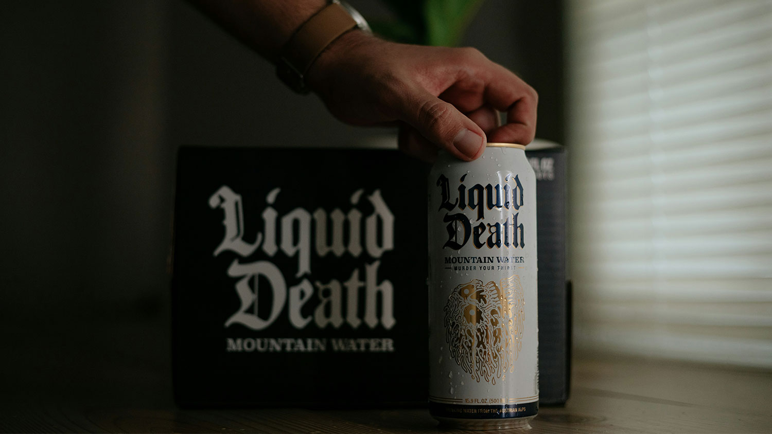
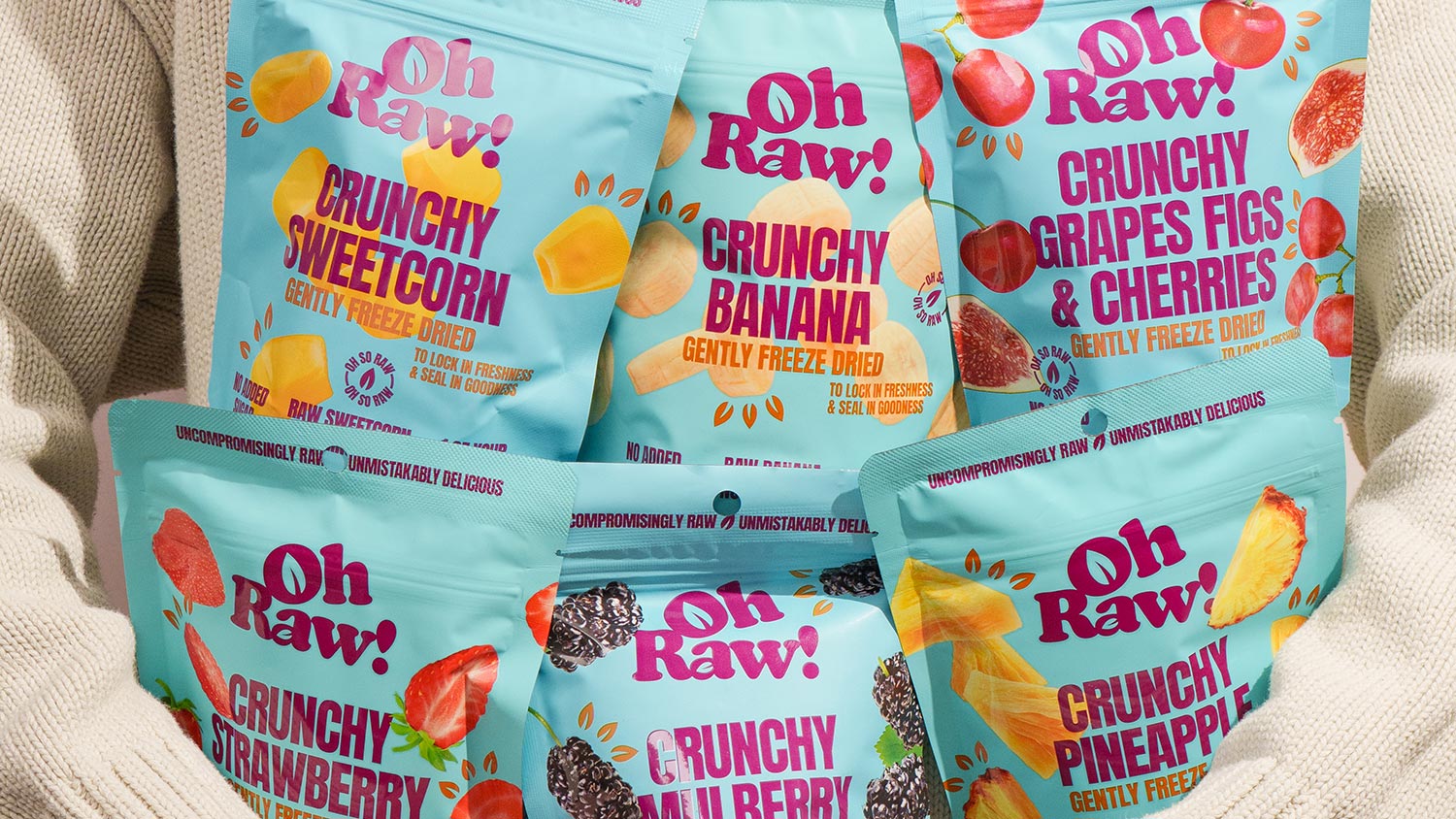
Illustration – Character, expression and the human hand
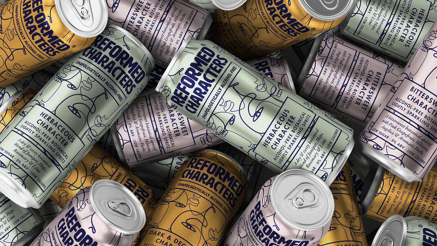
Packaging design illustration is thriving as brands prioritise personality and authenticity, featuring hand-drawn elements, casual typography, and unique storytelling – embracing irregular layouts, honest messaging, and low-fi charm to build trust and emotional connection.
Illustration has become one of the defining aesthetic choices for Gen Z-facing brands – and the reason is rooted in authenticity. In a visual landscape increasingly dominated by AI-generated content and hyper-polished production, a hand-drawn illustration signals human origin. It says someone made this. A person sat down and drew it. That signal carries genuine emotional weight for a generation that has grown up distinguishing between the real and the generated.
The illustration style matters as much as the decision to illustrate. Generic vector illustration – the kind that appears on hundreds of consumer brands – reads as generic. The illustration styles that perform best for Gen Z are specific enough to be instantly associated with a single brand – distinctive in line weight, character, colour application, and point of view.
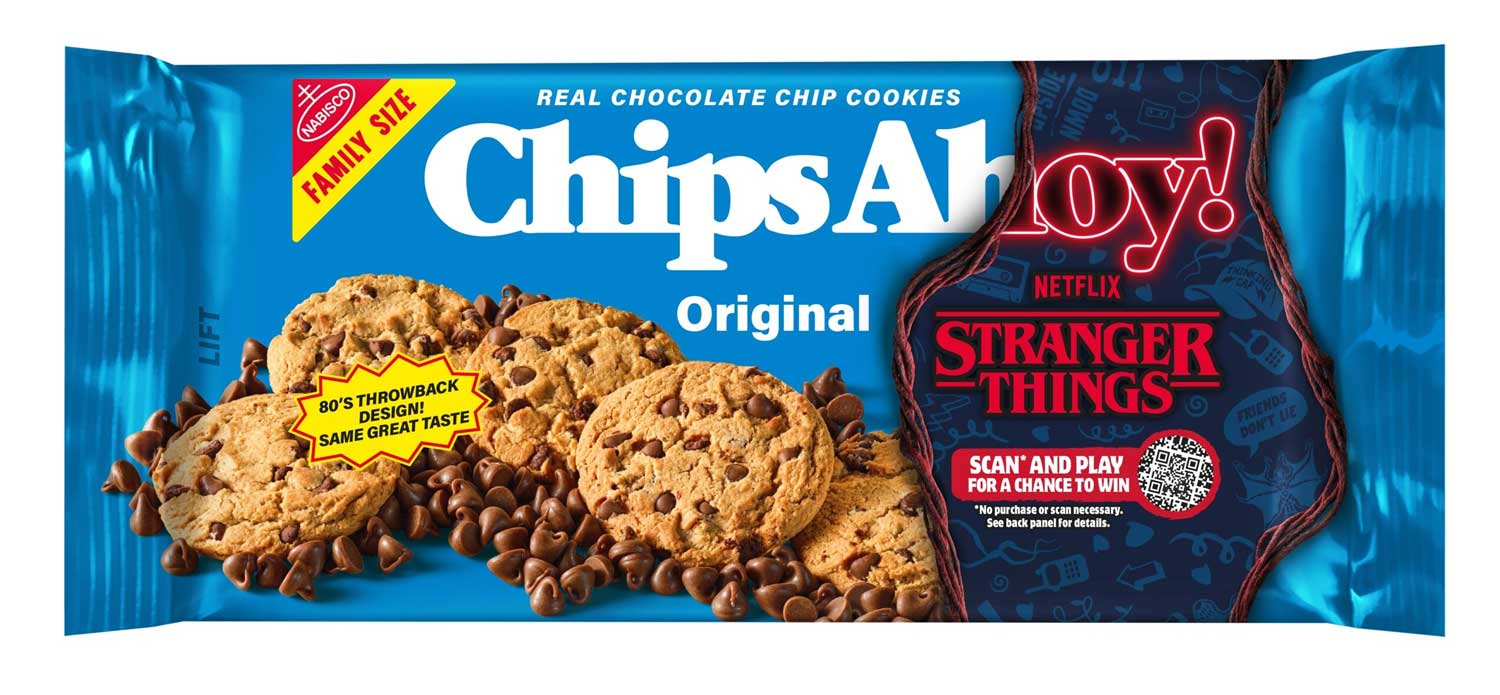
Nostalgia and retro aesthetics – Y2K and 90s revival
Gen Z’s relationship with nostalgia is one of the most commercially interesting cultural phenomena in contemporary consumer behaviour. They are intensely attached to aesthetic references from decades they didn’t live through – the 1970s, 1980s, and 1990s – filtered through a digital-native sensibility that makes everything feel simultaneously vintage and contemporary.
Gen Z has brought Y2K vibes back to life with a twist – dreamy pastels and contrasting brights that feel both comforting and stylish, with hand-drawn doodles, stickers, and playful typography adding a cute and expressive touch that makes packaging feel familiar yet fresh.
This creates a specific visual language that the most commercially successful Gen Z brands have colonised. Retro colour palettes applied to contemporary structural formats. Vintage typographic references used at digital scale. The visual shorthand of an earlier era made current through the confidence and precision of modern design.
Authenticity And Imperfection – The Anti-polish Aesthetic
Perhaps the most counterintuitive insight in Gen Z packaging design is the commercial value of imperfection.
A generation that grew up watching Instagram create a filtered, aspirational, artificially perfect visual world has developed a sophisticated distrust of that aesthetic. The brands that communicate authenticity – through deliberately imperfect design, honest copy, founder-led personality, and visual rawness – earn a quality of trust that polished corporate packaging cannot replicate.
This does not mean low quality. It means considered imperfection – the kind that signals human origin, genuine personality, and the absence of corporate committee decisions.
Gen Z no longer just buys a product. They choose an experience, a story, a stance. As a result, Gen Z packaging design becomes a cultural medium – a space for expression, emotion, and connection.

The Digital-physical Design Brief
The final and perhaps most commercially important design consideration for Gen Z packaging is the one most agencies still treat as secondary – digital performance.
A Gen Z consumer will encounter a product on TikTok before they see it on a shelf. They will add it to an Amazon basket from a phone screen three centimetres wide. They will share it on Instagram before they have finished using it. Every one of these encounters is a design brief in its own right – and most packaging is only built for one of them.
The brands that are growing fastest with Gen Z consumers are the ones whose packaging performs across all of these surfaces simultaneously. Strong enough to read at thumbnail. Distinctive enough to be recognisable without the logo. Photographable enough to earn organic social content. Shareable enough to travel from one phone to another without the brand needing to pay for the distribution.
That is the brief that Gen Z packaging design ultimately demands. Not a trend. Not an aesthetic. A complete rethinking of where packaging lives and how it works.
The most important principle is that the design has to earn attention before it asks for trust.
Gen Z consumers encounter products digitally before they encounter them physically – on a TikTok feed, in a fridge restocking reel, or as a thumbnail on Amazon.
Creating packaging design for Gen Z means designing for all of those surfaces simultaneously, not just the physical shelf. Bold colour systems, expressive typography, and visual identities with a clear and ownable personality consistently outperform safe, category-conventional design with this audience.
A significant one – and it is one of the areas where the most visible category disruption is happening.
The clean, neutral sans serifs that defined most packaging design for the past decade communicate safety and convention, which is the opposite of what Gen Z-facing brands want to signal.
Creating packaging design for Gen Z that uses expressive display fonts, hand-drawn letterforms, oversized typographic treatments, or retro-influenced serifs communicates personality before the copy is read.
Oatly’s handwritten, conversational typographic style and Surreal’s bold character-led approach are both examples of typography doing brand personality work that would take paragraphs of copy to achieve any other way.
Because Gen Z discovers and shares products visually – and colour is the fastest and most ownable visual signal a brand has.
The right colour, consistently defended, becomes a brand asset that compounds over time.
They are not in tension – for Gen Z, authenticity is an aesthetic.
The hand-drawn illustration style, the deliberate imperfection, the founder-led personality in the copy – all of these are design choices that communicate genuine origin in a visual landscape increasingly dominated by AI generated content and hyper-polished production.
Creating packaging design for Gen Z that feels authentic means making specific, confident creative decisions rather than trying to appeal to everyone.
The brands that resonate most with this generation are the ones whose design clearly came from a specific point of view.
Let’s talk – email us at hi@greatergood-brands.com

Sign up to our building better brands newsletter
Free insights for scaling brands