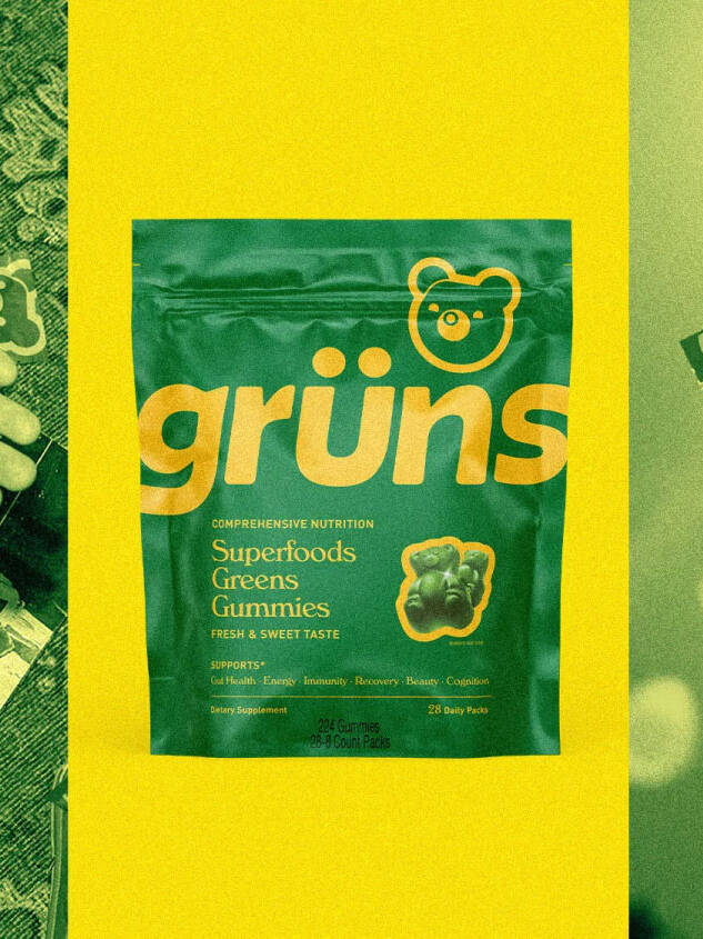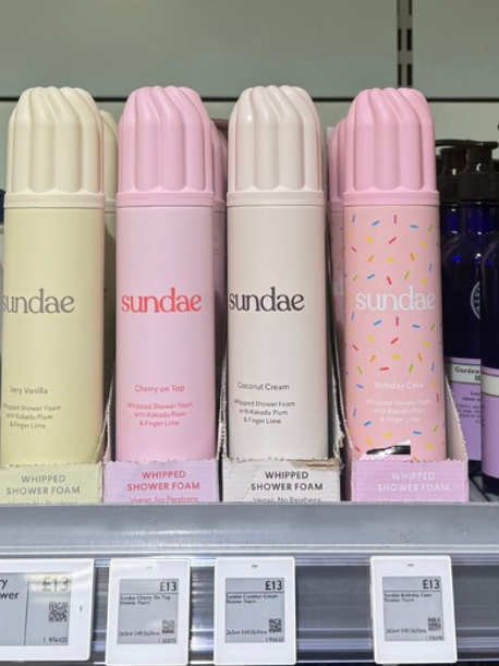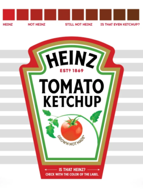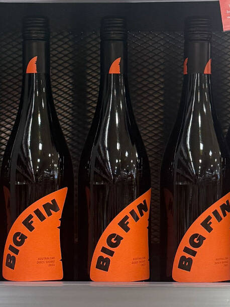

This is what your brand is doing when it plays by the same category cues as every other brand…
Premium = Black & Gold
Cereals = Yellow, Orange, Red
Oral Care = White
Feminine Care = Pink
Menopause Care = Purple
There’s a difference between using colour to guide a consumer through range, flavour and experience navigation – and just reaching for the same clichéd category cues as everyone else.
The sentiment can often be “our brand feels right for the category and like it has always existed” – perhaps it does, but perhaps it feels like it has always existed because it has borrowed every clichéd category cue from the last 200 years, and the result is an amalgamation of every brand on shelf and every brand which has ever existed.

Your brand shouldn't look like everyone else's category clone
Let’s build yours from scratch, not from the shelf
Sign up to our building better brands newsletter
Free insights for scaling brands