AEVUM
Supplement Branding
Supplement branding and packaging design for a new range of premium longevity supplement
Type Of Client
Consumer Packaged Goods
Type Of Work
Brand Strategy Branding Packaging Design Website Design Merchandise


The Brief
The premium supplement category is growing fast. Most of the brands in it look the same. Clinical and cold on one end. Generic wellness on the other.
AEVUM’s longevity formulation is exceptional. They needed a supplement branding agency that could build a brand to reflect that. One that could visually justify a premium price point, while still feeling like a considered part of everyday life.
We built the brand from the ground up – creating a strategic positioning, visual identity, and packaging design system that could command premium positioning and hold its own in the most discerning retail and DTC environments.
The Work
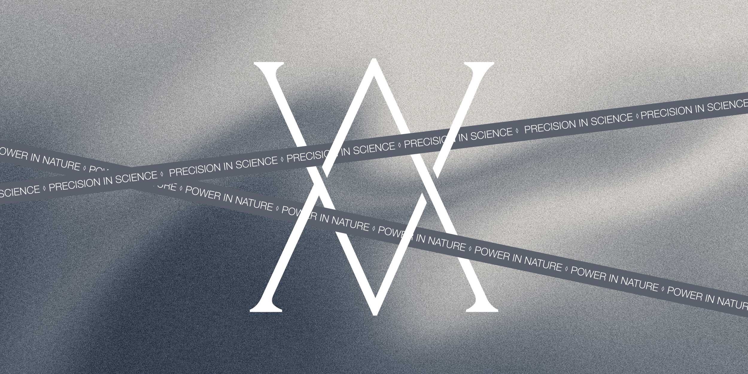
Precision in Science, Power in Nature
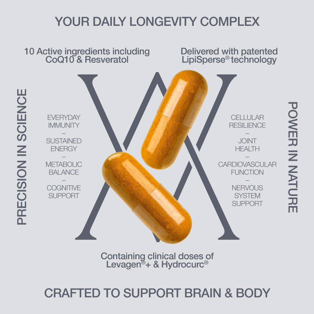
AEVUM sits at the intersection of scientific rigour and natural ingredients – and that duality needed to be expressed clearly. The brand needed to feel like a considered part of everyday life, not a clinical transaction. We created the brand strapline ‘Precision in Science, Power in Nature’ to hold that tension. Premium and measured enough to justify the investment, familiar enough to earn a place in the daily routine.
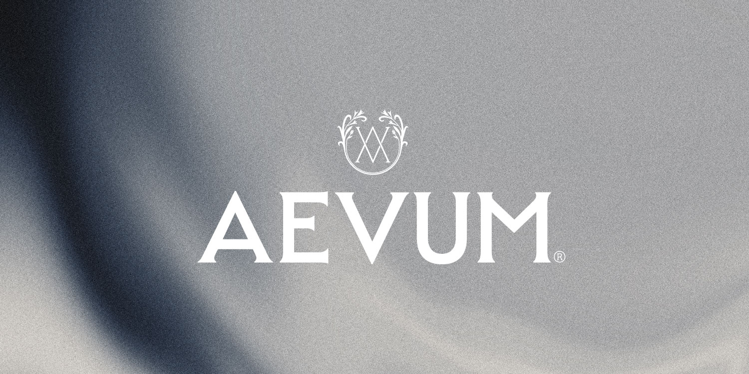
A Mark Built For The Long Term
At the heart of the identity is a bespoke monogram – two intersecting letterforms enclosed within a botanical frame. The visual embodiment of Science meets Nature. It carries the authority of a heritage crest without the rigidity of one – signalling craft and permanence.
The name AEVUM – Latin for an age, for eternity – shaped every decision. The wordmark is architectural, precise and enduring – as if carved from stone.
The Fountain of Youth
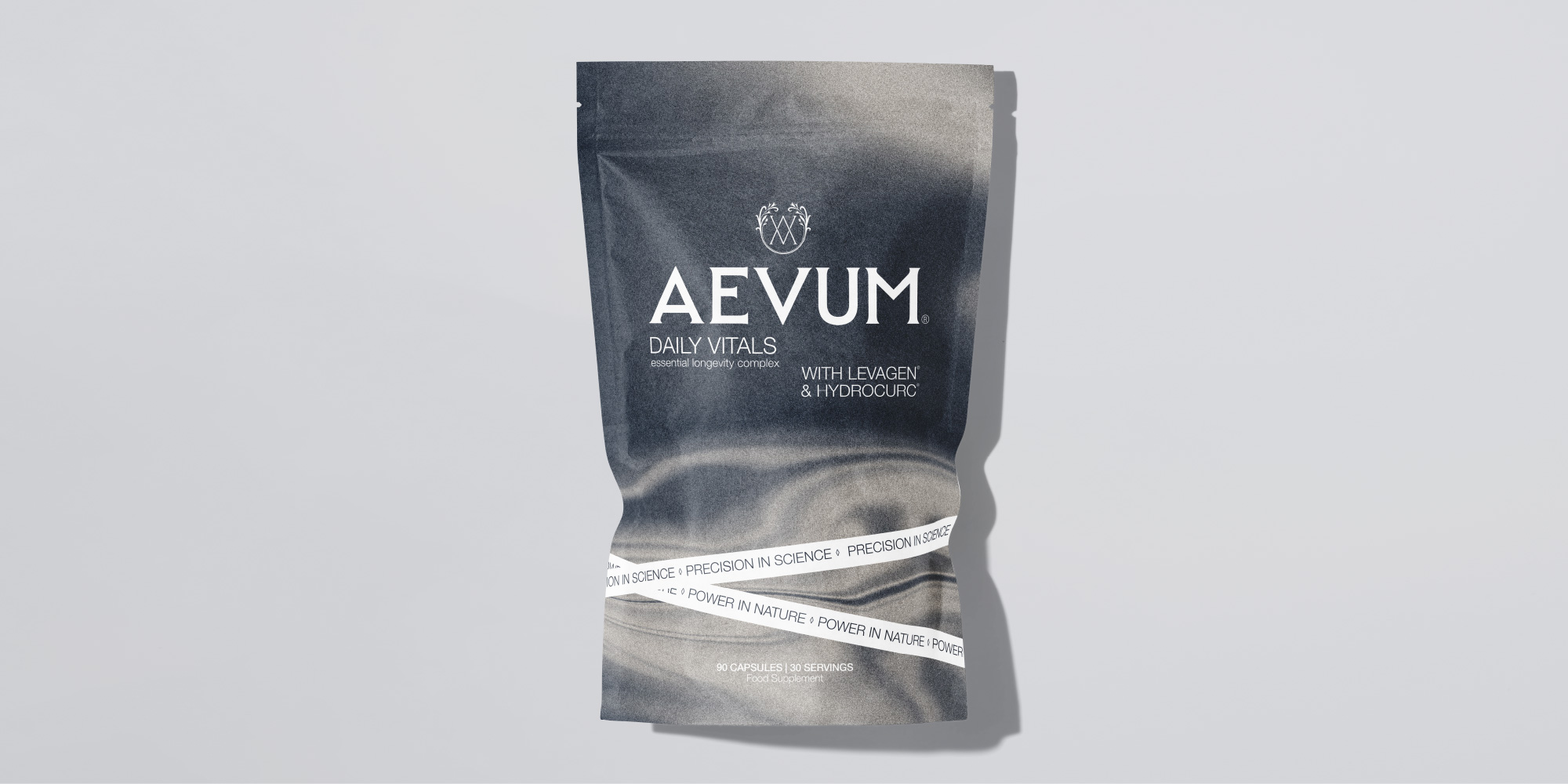
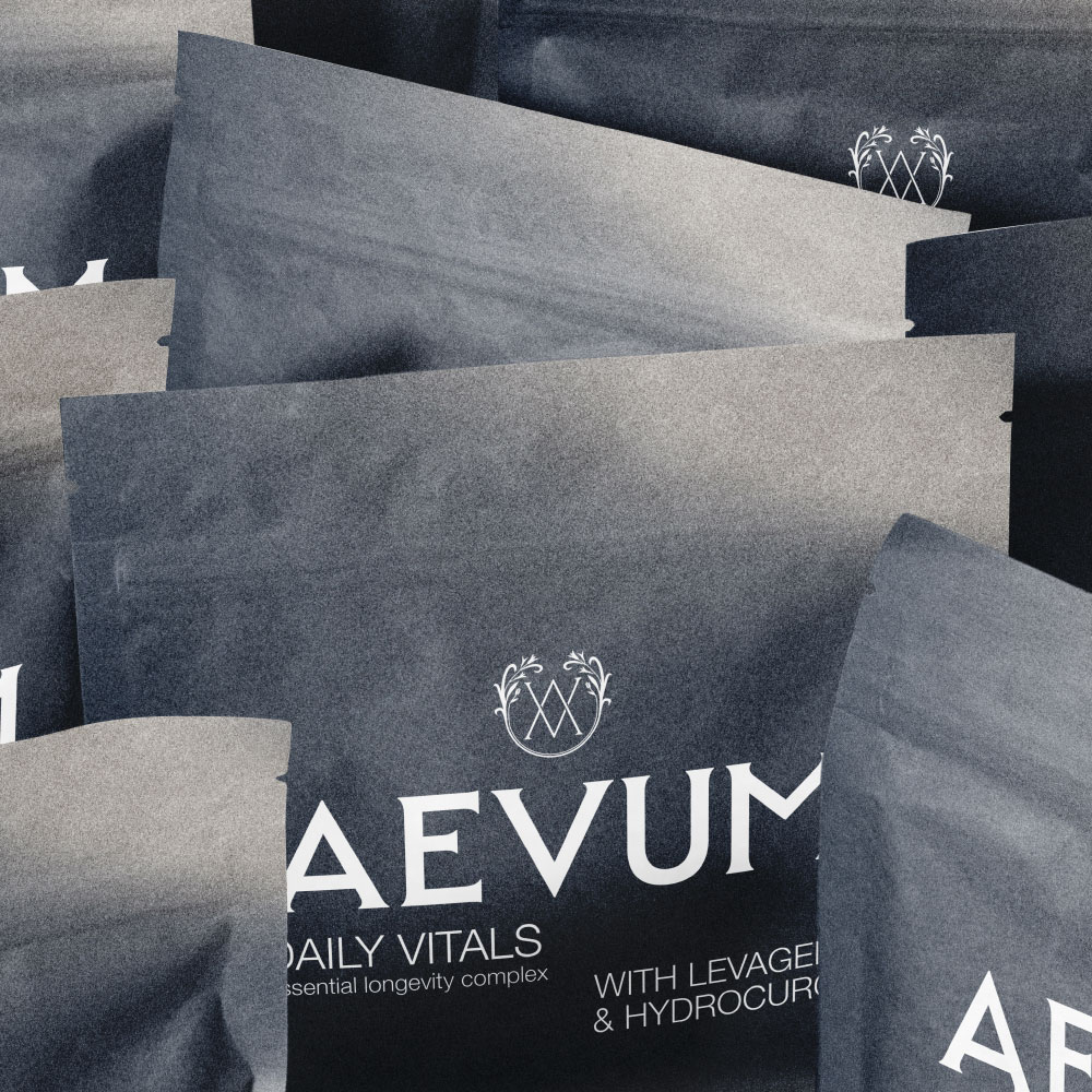
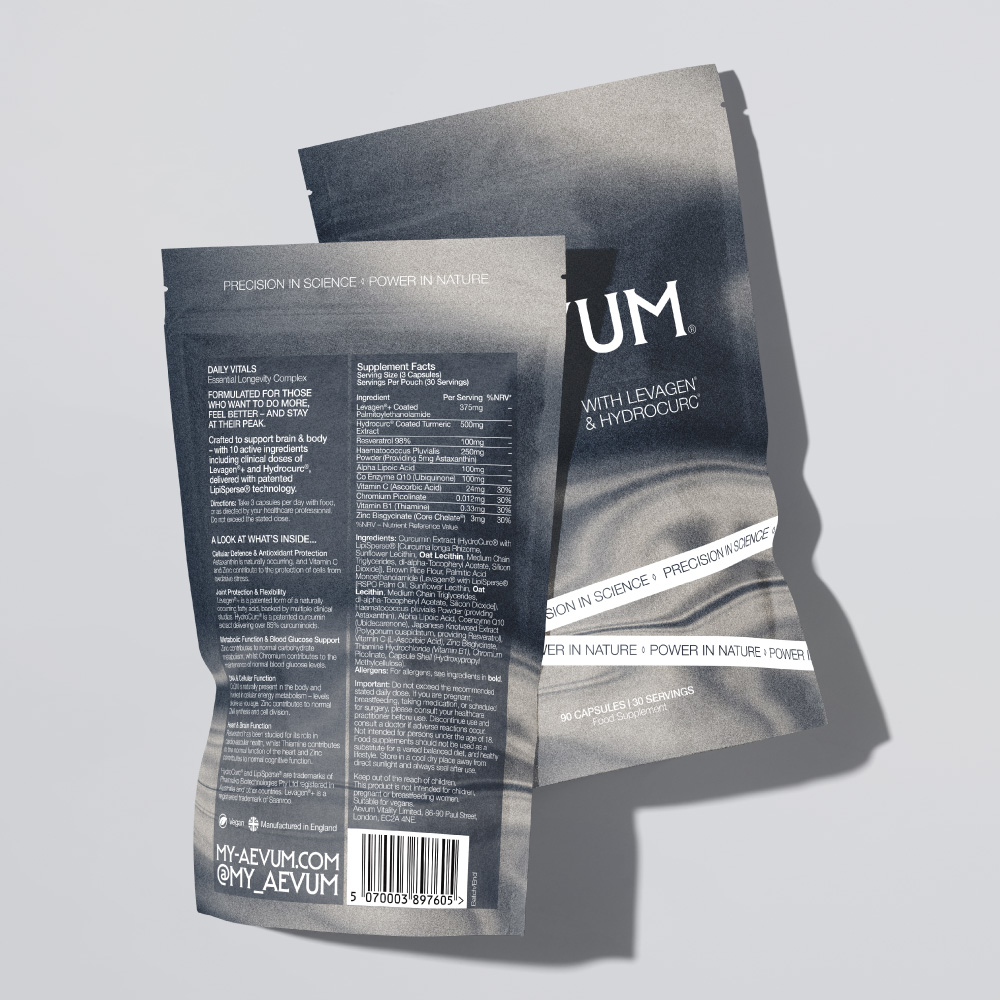
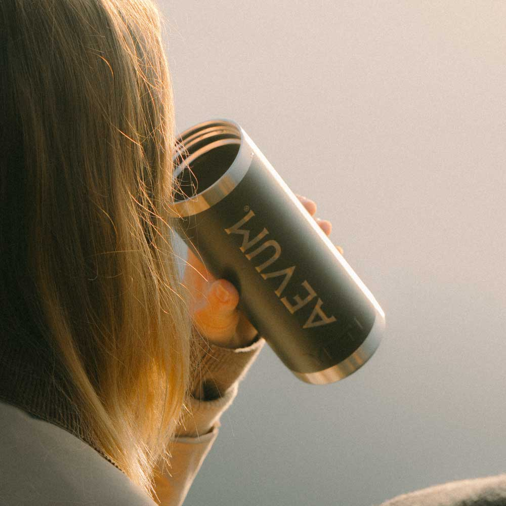
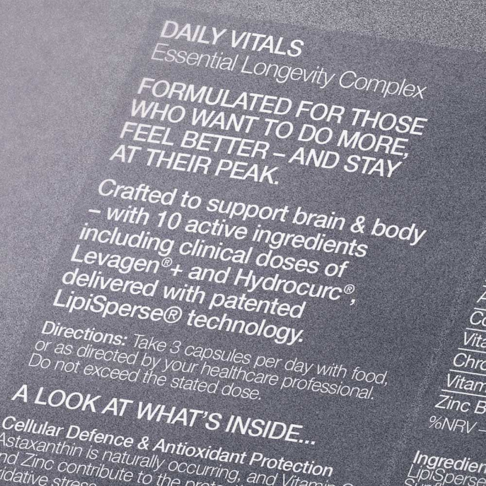
Avoiding cliched supplement category cues – the packaging design system is built on a deep slate grey, with white typography and minimal detail.
The hero visual draws on one of the oldest symbols in human culture. The Fountain of Youth. Still water as mirror. The surface we return to when we want to see ourselves clearly. Rendered in monochrome, the flowing visual on pack feels almost geological – ancient, elemental, enduring. It communicates longevity without explaining it.
The Outcome
AEVUM launched with a brand that justifies its premium price point without having to explain it. The design is timeless rather than trend-led – built on elemental imagery and heritage craft. It earns its place in the daily routine, looking as considered on day one as it will in five years.
How We Helped
Brand Strategy
Supplement Branding
Packaging Design
Website Design
Merchandising