Getting a listing is only the beginning. Here’s how to tell if your packaging is going to survive on shelf – or disappear into it.
Most brands don't fail at retail because the product is bad.
They fail because the packaging isn't doing its job. And by the time that becomes obvious – in the rate of sale, in the confused consumers, in the buyer conversation that doesn't go the way you hoped – the damage is already done.
Retail is unforgiving. Shoppers make decisions in seconds. Buyers decide in minutes. Neither has the time, or the obligation, to give your brand the benefit of the doubt.
These are the eight signs that tell us a brand isn’t retail-ready…
1. You're having to explain what the product Is
- To buyers in a meeting
- To consumers at a brand activation
- To trade show visitors who immediately ask – ‘What Is It?’
This is the clearest sign that the packaging design isn’t working, and isn’t doing its job properly. When you’re in the room, you can explain it. When you’re not – the product has to speak entirely for itself.
A shopper won’t ask questions. They’ll just move on.
The pack needs to answer three things instantly: what it is, who it’s for, and why they should buy it. If any of those three require explanation, the design has failed its most basic commercial test.
2. It blends into the category
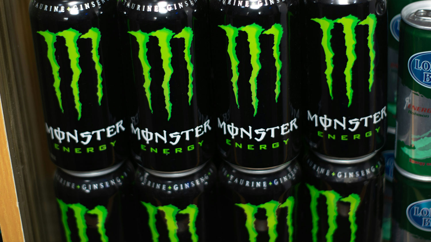
Stand your product on a real shelf, surrounded by the real competition. Now take a photo. Look at the photo. Does your brand stop the eye – or disappear into the fixture?
Blending in feels safe at the design stage. It often looks intentional – ‘we’re playing to category codes.’ But on shelf, it’s invisible, and invisible doesn’t sell.
Distinctiveness isn’t about being loud. It’s about being ownable and creating commercial brand assets. Colour, form, typography, illustration, language – all of these can create standout.
3. It's unclear which category it belongs to
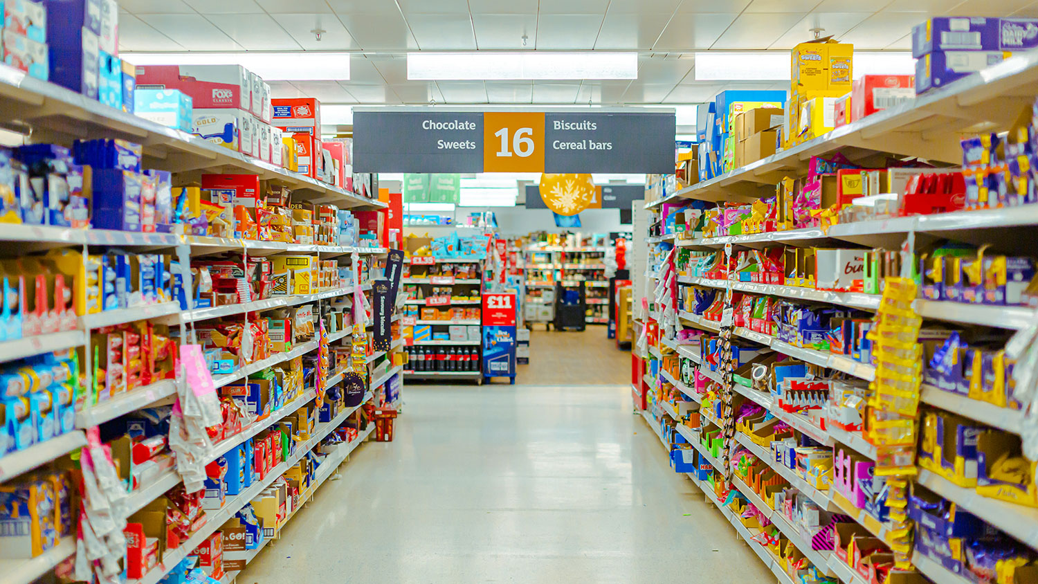
- If a buyer can’t immediately place your product in the right fixture, it won’t get ranged in the right place
- If a shopper can’t find it, they won’t be able to buy it
We see this most often with brands that are trying to straddle two categories at once. A health drink that reads as a soft drink and then seems too expensive in comparison to competitors. A supplement that positions itself as a food product. The ambition is understandable but the commercial consequences are significant.
Own one category clearly and become an expert in it before expanding.
4. The range is difficult to navigate
One of our biggest requests in packaging design is from scaling brands who have allowed their product and packaging range to become incoherent and noisy.
We generally see two themes playing out with packaging range navigation:
- Every SKU in the range looks identical – shoppers can’t distinguish between flavours, variants or formats. The range collapses into one indistinct block which is overwhelming to shop in.
- Or… Every SKU looks completely different – no visual consistency, designed by different agencies, freelancers, in-house staff, an individual colour per SKU which has become impossible to manage…
Retail-ready packaging design has a clear architecture – consistent enough to block on shelf and build brand recognition. Distinctive enough for shoppers to navigate with confidence.
5. The packaging design has no visual system
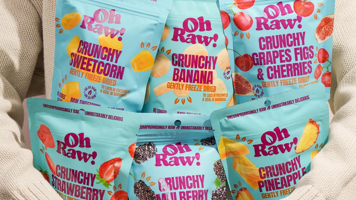
Brand blocking is one of the most commercially undervalued concepts in FMCG packaging. It’s the ability of a range to read as a single visual unit on shelf – to own a section of the fixture rather than just occupy it.
Without a visual system – a consistent use of colour, structure, typography and brand assets across the range – there is no blocking. Each SKU competes for attention individually. The cumulative shelf impact that a coherent range delivers simply doesn’t exist.
A visual system doesn’t constrain creativity. It provides the framework within which variants, flavours and extensions can grow without the brand fragmenting.
6. The hierarchy is wrong
Another common mistake we see in packaging design and requests from clients is in poor hierarchy.
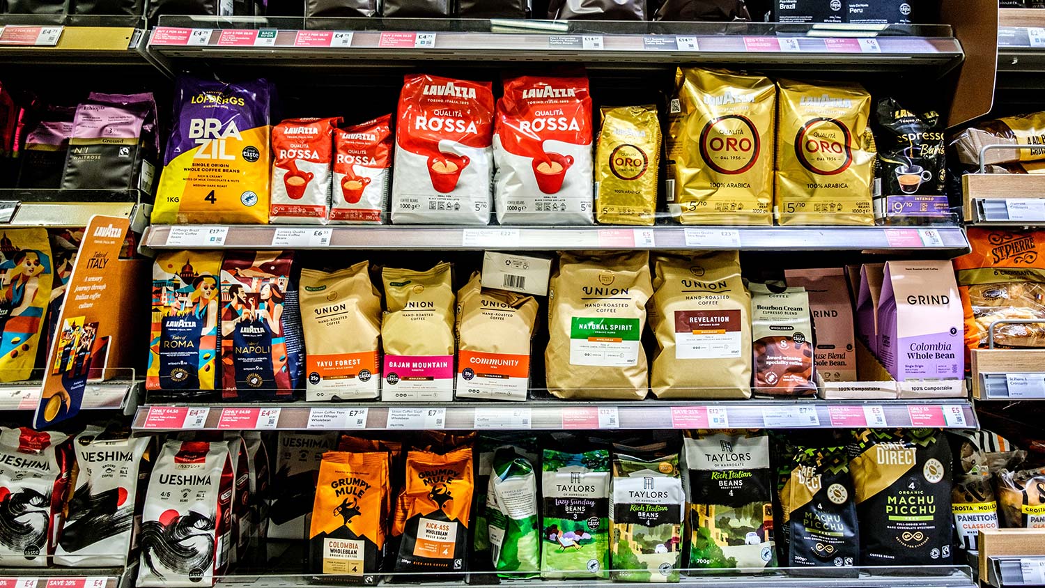
Every pack has a job to do in a specific order. Brand recognition first. Category cue second. Product variant or flavour third. Benefit or reason to believe fourth.
When the hierarchy breaks down – when a flavour descriptor shouts louder than the brand name, or a claim dominates the architecture at the expense of clarity – shoppers lose the drive to buy. The eye doesn’t know where to go and darts around – the decision gets harder and the product stays on shelf.
7. Category competition hasn't been addressed
Too many brands are designed in isolation. The brief focuses on the brand, the story, the founder’s vision. The competition and category landscape is an afterthought.
The result is packaging that looked strong in isolation and becomes immediately weak on shelf.
Retail-ready packaging is designed with the fixture in mind from the start. What are the dominant colour codes? What does the premium end of the category look like versus the budget end? Where is the visual gap that this brand can credibly own? These are not questions to answer after the design is done.
You’re not just designing a brand – you’re designing a brand that has to win in a specific retail category.
8. The range is lacking reasons to believe
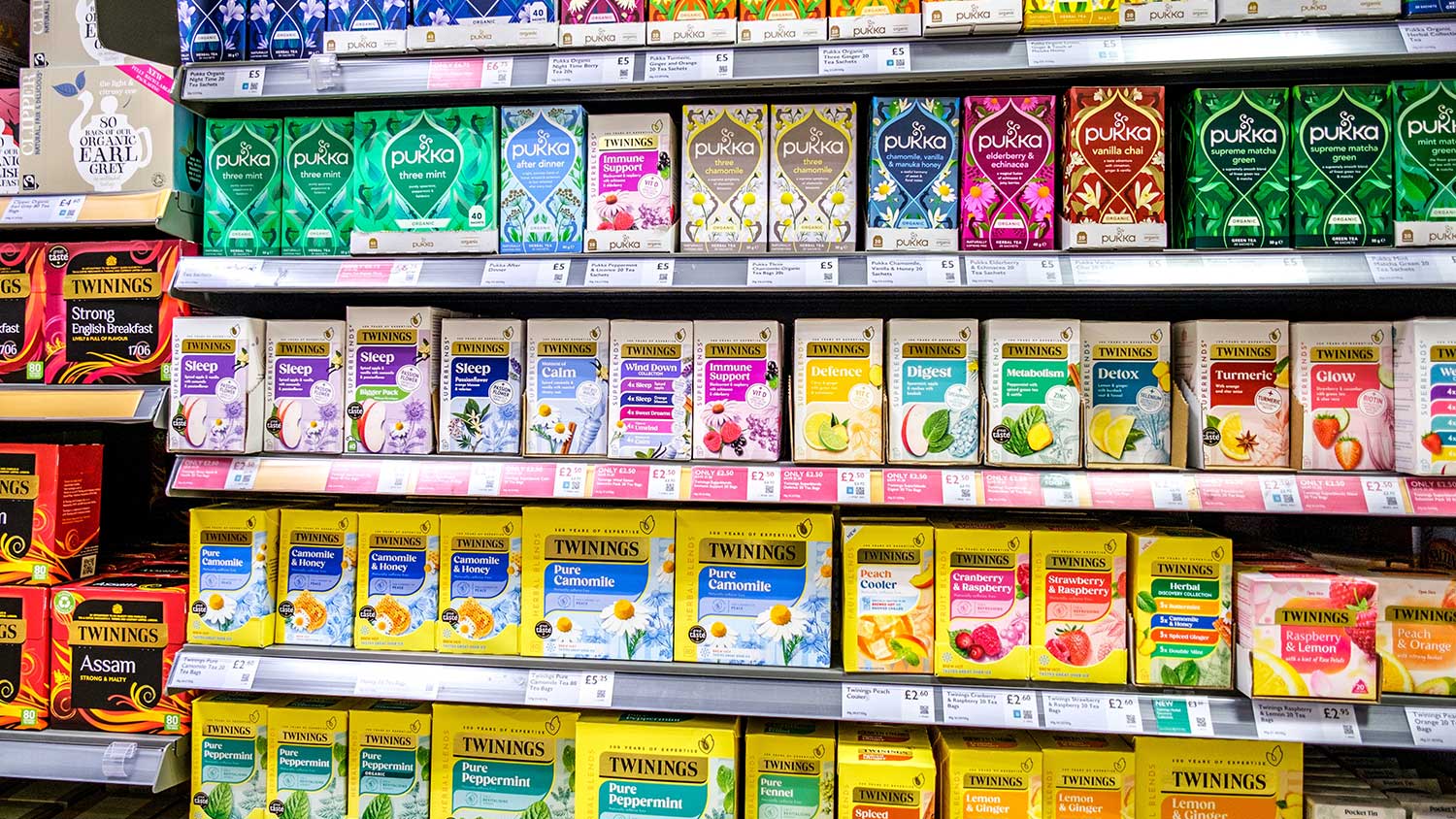
Claims, credentials, virtue signals, reasons to believe – call them what you like. They are the on-pack evidence that justifies the purchase.
In a market where consumers are turning packs over and cross-referencing ingredients on TikTok, the absence of credible reasons to believe is felt acutely.
This isn’t about cramming every available accreditation onto the front of packaging. It’s about making sure the right signals are visible, legible and believable.
So – what does retail-ready actually look like?
It looks like a product that works without the brand owner. That stops the eye without screaming. That communicates clearly in the time a shopper is willing to give it.
It's a range that blocks on shelf, navigates easily and holds together as it scales. It's packaging design that has genuinely interrogated the category competition and found a position that's both distinctive and ownable.
Most importantly, it's a brand that earns the second purchase – not just the first.
If any of the eight signs above feel familiar, it's worth addressing them before the next buyer conversation. Not after.
Retail-ready packaging works entirely on its own – without you in the room to explain it. It stops the shopper’s eye, communicates what the product is, who it’s for, and why to buy it in seconds.
It blocks well on shelf, navigates easily across a range, and earns the second purchase, not just the first.
Most brands fail because their packaging design isn’t doing its job. Shoppers make decisions in seconds, buyers decide in minutes, and neither has time to give a brand the benefit of the doubt.
The product may be excellent, but if the packaging fails to communicate clearly and quickly, it won’t sell – and by the time the data reflects this, the damage is already done.
A simple test: if you’re having to explain what your product is – to buyers, consumers, or anyone who picks it up – the packaging is not working.
Place your product on a real shelf surrounded by real competition, take a photo, and ask honestly: does it stop the eye, or disappear?
If you can’t answer yes immediately, there’s work to do.
No. Blending in feels safe at the design stage but becomes invisible on shelf – and invisible doesn’t sell. Distinctiveness isn’t about being loud, it’s about being ownable.
Brand blocking is the ability of a range to read as a single visual unit on shelf – to own a section of the fixture rather than just occupy it. Without a visual system (consistent colour, structure, typography, and brand assets across SKUs), each product competes for attention individually.
A coherent range that blocks together has far greater cumulative shelf impact than a collection of disconnected products.
One of our favourite projects we work with our clients on is redesigning for retail scaling – tell us more and send us a message at hi@greatergood-brands.com
Your brand should be walking into every buyer meeting already winning
Let’s make it retail ready…

Sign up to our building better brands newsletter
Free insights for scaling brands