Mo & Marine
Baby Wipe Packaging Design
Brand strategy, brand design and packaging design for a sustainable baby wipe brand with big ambitions
Type Of Client
Consumer Packaged Goods
Type Of Work
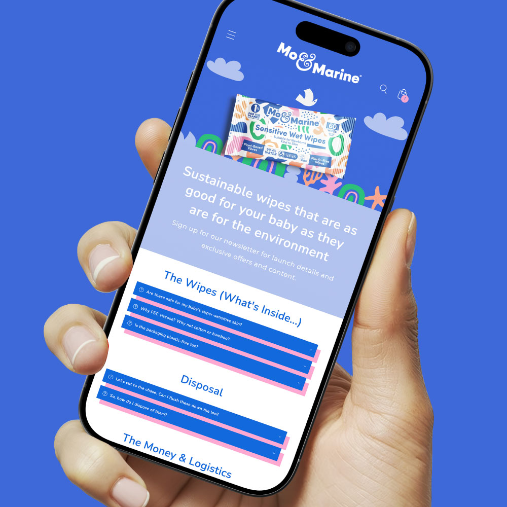
Brand Strategy Branding Packaging Design Website Design
The Brief
A household with a newborn can go through up to 10 packs of baby wipes a month. Multiply that across the first few years of a child’s life and the numbers get uncomfortable quickly – with most wipes ending up in landfill, drainage systems or the ocean.
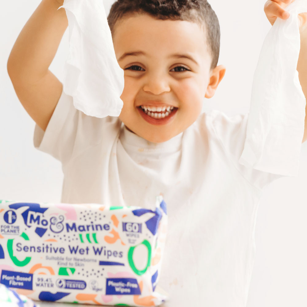
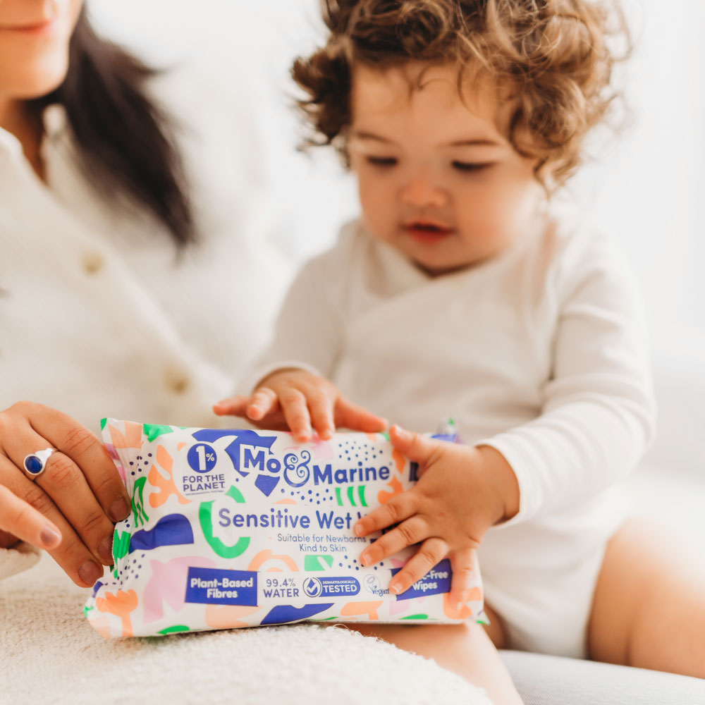
Mo & Marine are on a mission to wipe out unsustainable family waste and were looking for a baby wipe packaging design agency for their first product.
Our early research showed that although consumers and families in particular are looking for sustainable alternatives to everyday convenience – there is a deeply held belief that sustainable products come with a compromise.
The brief was to create a brand which dismantled this belief – encouraging consumers that sustainability doesn’t have to equal sacrifice and to create a playful, disruptive brand with a real story.
The Work
A challenger brand in a category of safe choices
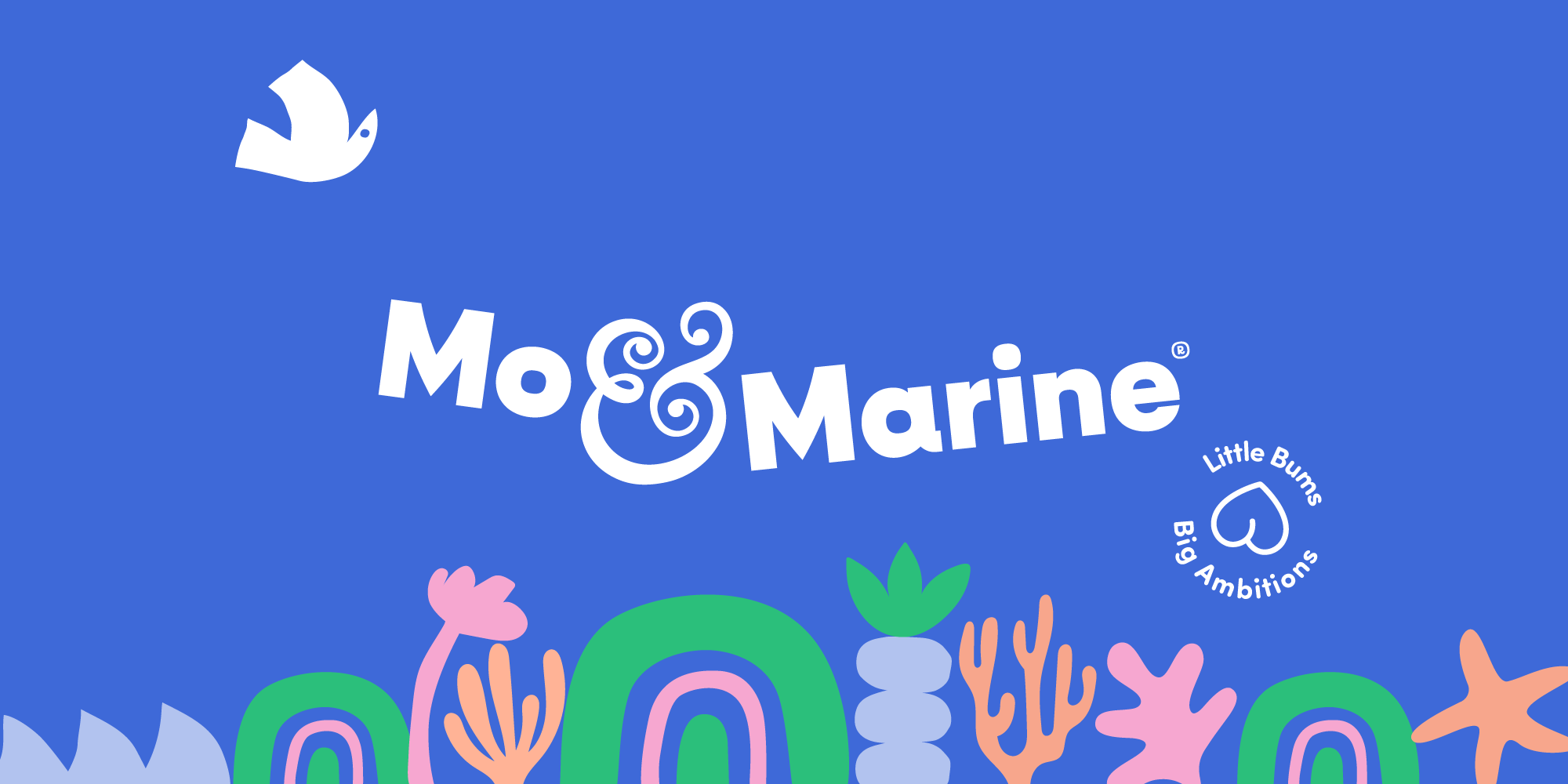
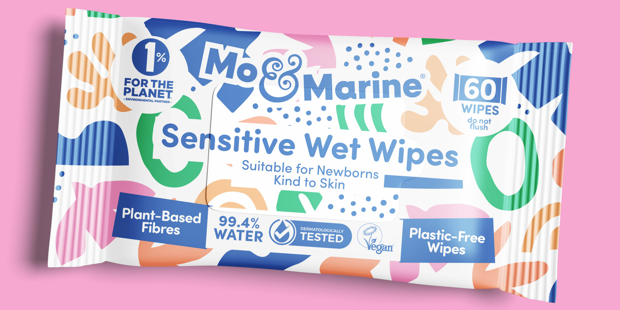
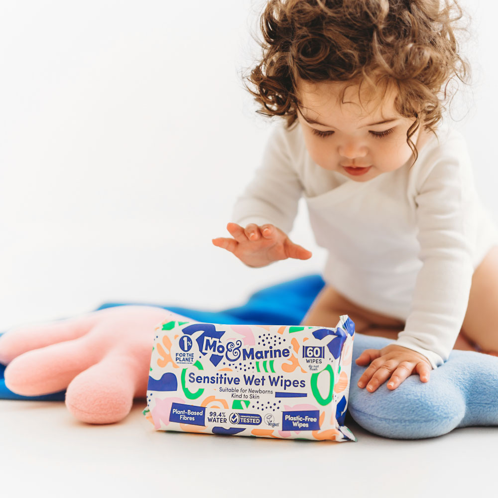
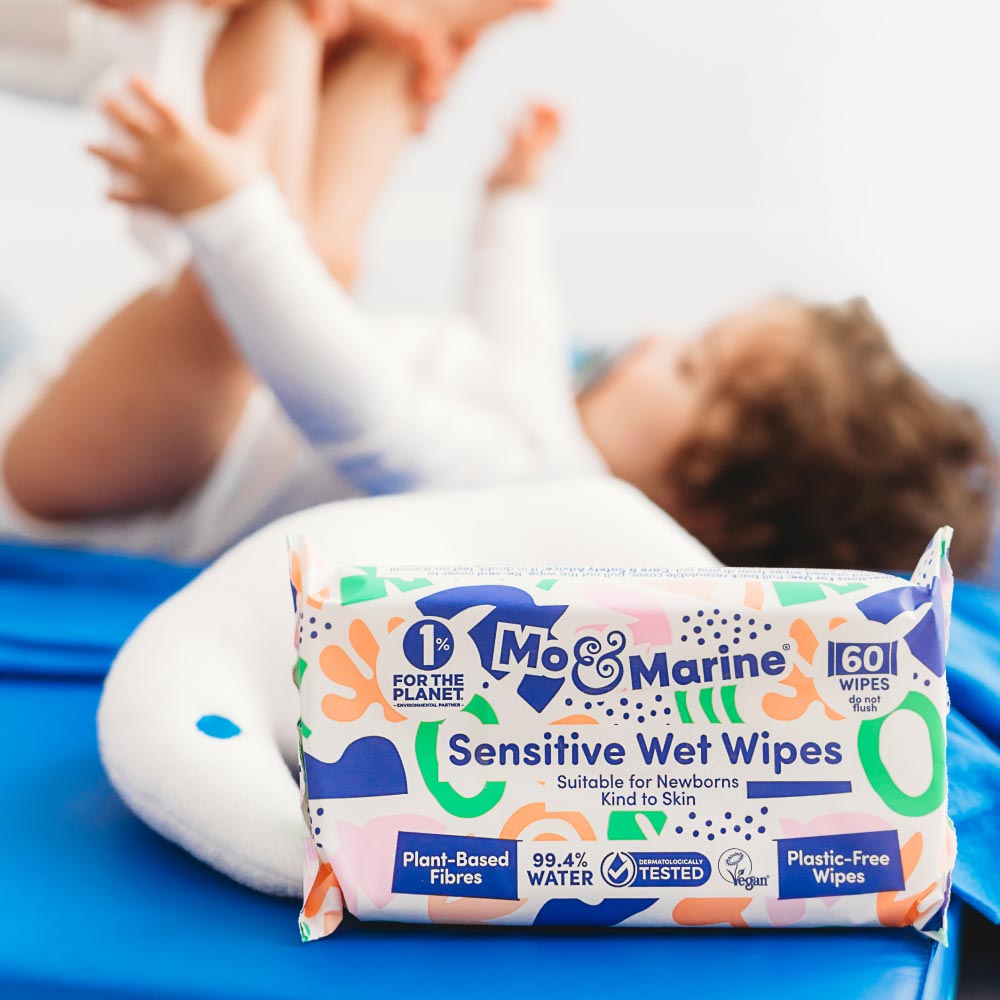
The baby category has historically leaned hard into soft palettes and safe, clichéd imagery. Mo & Marine was built to challenge that convention directly. The mid-shade blue chosen as the masterbrand colour was deliberate – confident enough to feel like a challenger, marine enough to reference the ocean without being obvious about it, and distinctive enough to stand apart from every pastel and earth tone on the fixture around it.
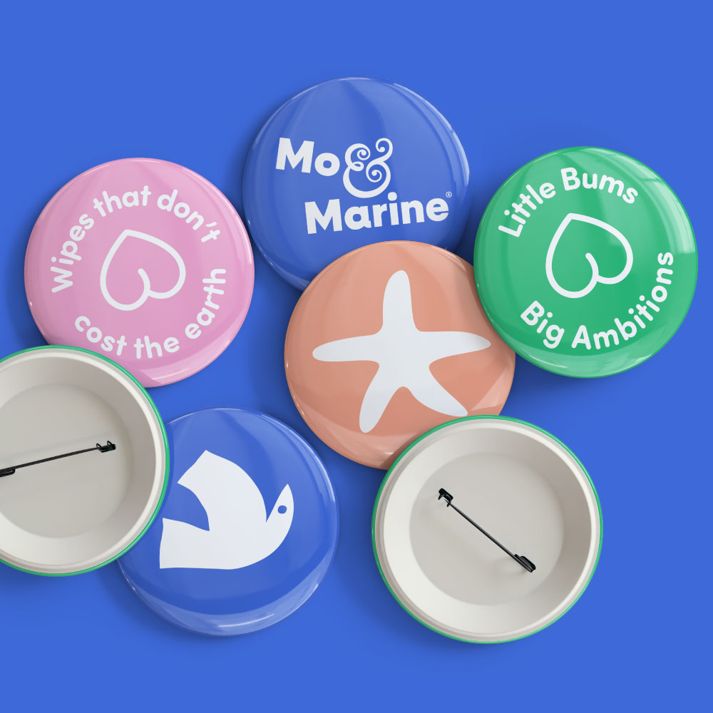
The wordmark is playful and stacked – tumbling into the scene. The ampersand is a world of its own – a swirl of seaweed, a floral form, and a shape known to evoke the silhouette of a pregnant mother and child.
Little Bums, Big Ambitions
The brand strapline ‘Little Bums Big Ambitions’ captures the truth at the heart of Mo & Marine: that the small, everyday choices parents make genuinely stack up. The strapline gives the brand a warmth and a wit – speaking to parents as the intelligent, slightly exhausted people they are, just trying to do their best.
Inspired by Land, Sea & Air
The brand identity is rooted in the environmental story Mo & Marine was built to address.
Where do baby wipes actually go? The answer became the creative foundation for the illustration world. The land – where the majority of baby wipes end up in landfill, sitting for decades. The seas and oceans – where wipes frequently end up after being flushed, becoming fatbergs, clogging drains, and entering rivers and oceans through storm overflows during heavy rainfall. The air – where wipes create pollution as they degrade in landfill, and where incineration releases a significant volume of airborne pollutants.
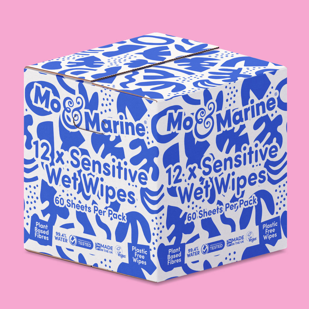
From these three territories emerged a rich, nature-led illustration world – coral reefs, seaweed forms, stones, botanicals, and the clean open air – rendered in a palette that feels warm, playful, and scalable as the range grows.
The Outcome
Mo & Marine launched with a vibrant and differentiated brand and packaging design – immediately winning awards and recognition for their first class product and standout brand and packaging design.


Katie, Founder, Mo & Marine
Greatergood® has been a great design partner for us; our branding and packaging are important differentiators for us as a challenger brand and they worked closely with us to ensure that both fully represent the company, our products and our values. Our packaging design is one of the first things every customer, buyer or partner comments on.

Daniel, Founder & Creative Director, Greatergood® Brands
The beauty in Mo & Marine is in the simplicity and versatility of the illustrations – all the better that we have a real tangible story behind it. We always encourage illustration in our projects where possible, it gives real differentiation, makes an emotional connection with consumers and creates a category standout which wins every time.
Featured In
How We Helped
Brand Strategy
Branding
Baby Wipe Packaging Design
Website Design