Virtue Sourdough
Sourdough Packaging Design
Brand strategy, sourdough packaging design, and retail commercialisation for a premium Italian sourdough brand entering UK grocery retail
Type Of Client
FMCG
Food & Drink
Type Of Work
Brand Strategy Packaging Design Retail Strategy
The Brief
Virtue had a product that deserved to be on the shelves of the UK’s best grocery retailers. A premium Pinsa Romana sourdough – long fermentation, made in Italy, Great Taste Award winning – with the texture, quality, and price point to compete at the top of the bakery and pizza base category.
The problem was the packaging. Virtue’s existing design was failing to communicate what made the product special, failing to create any shelf presence in a category crowded with brands telling similar stories, and failing to give retail buyers a clear commercial reason to list it. The brand lacked a clear retail story, a brand blocking mechanism, and a consumer proposition strong enough to justify its premium positioning.
The brief was to solve all of that – and make Virtue retail ready.
The Work
The vital ingredient
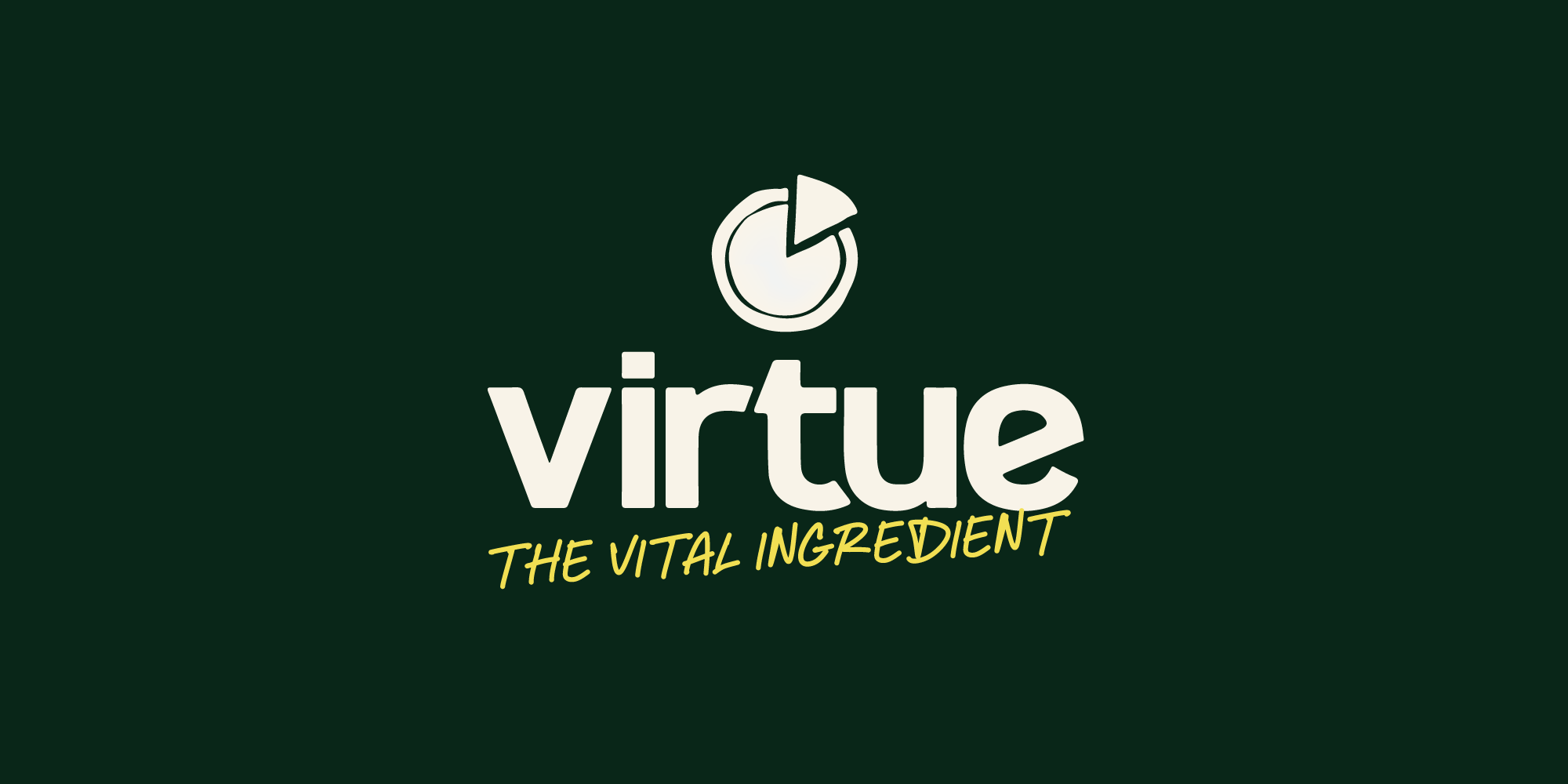
We built the brand around a single positioning statement of excellence: The vital ingredient – placing Virtue as the missing ingredient that separates a homemade pizza from a restaurant quality one, and justifying its premium price point against every alternative in the category.
The statement immediately resonated with Virtue – noting that the positioning statement worked across both their ambitions in grocery – and in foodservice.
The V
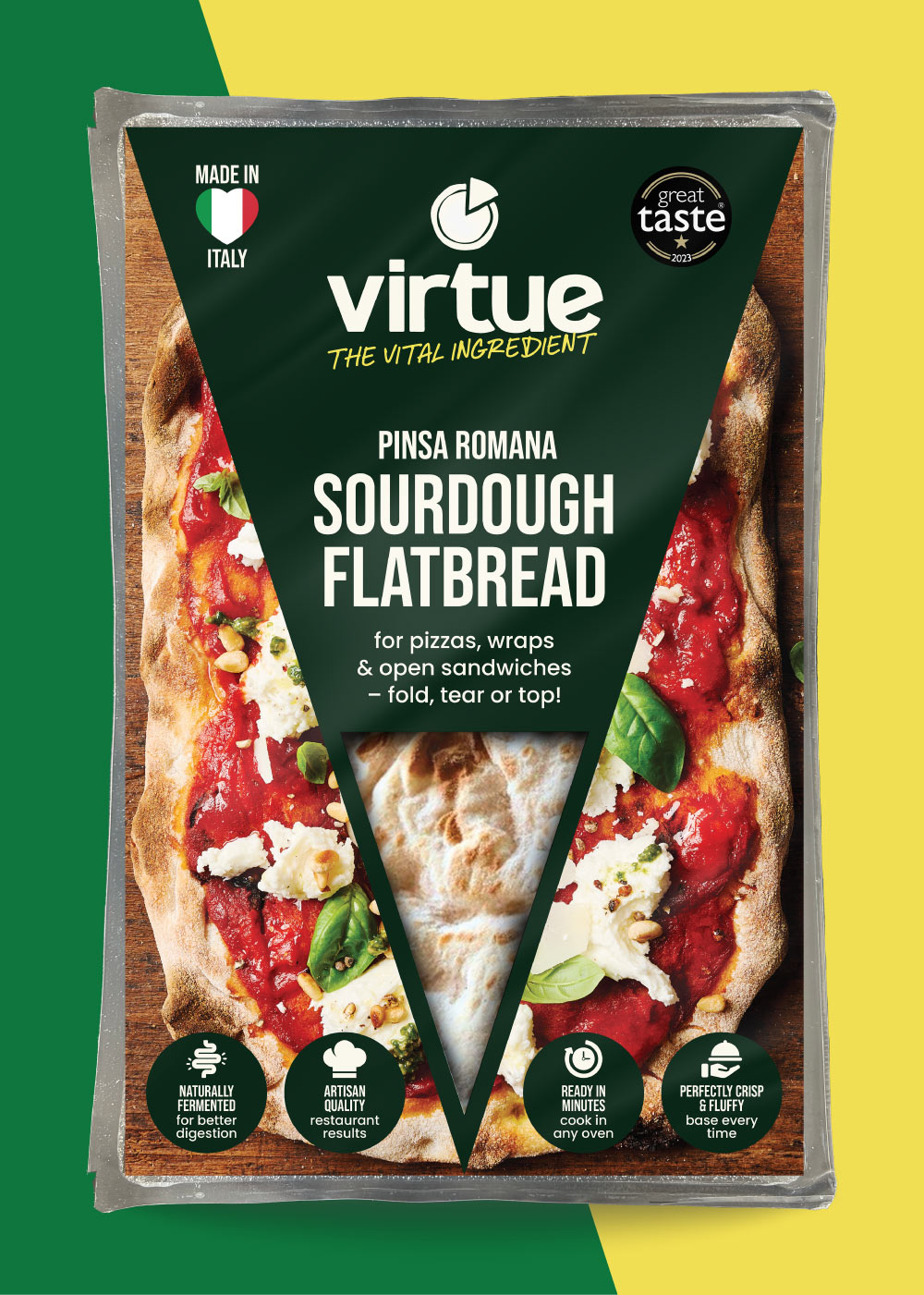
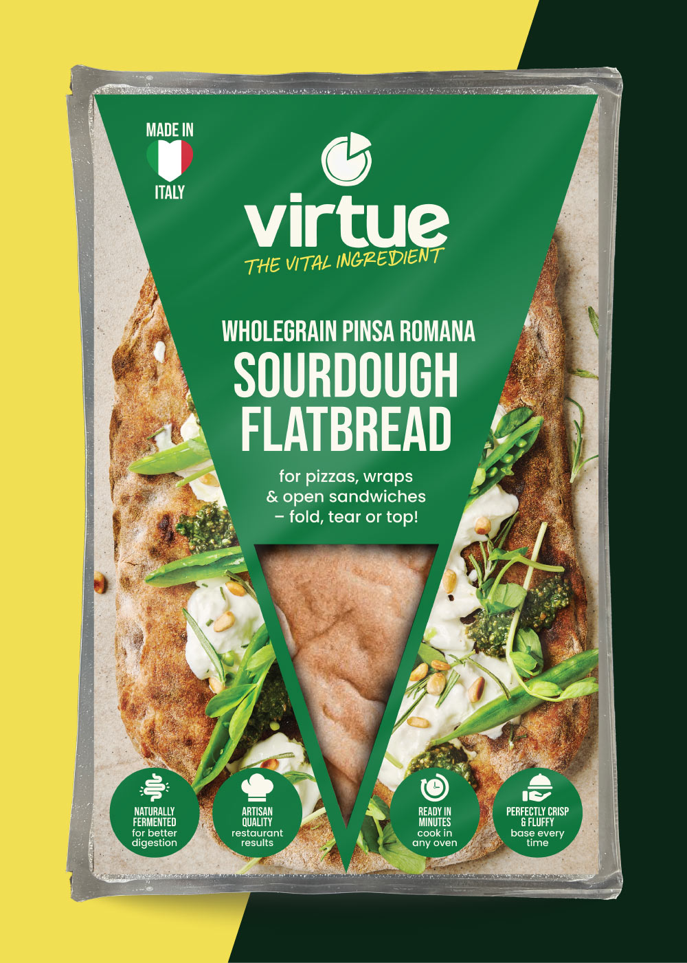
The letter at the heart of the brand name became the brand blocking mechanism. A bold, confident V shape — graphic enough to command fixture presence across multiple SKUs, and specific enough to be read as a pizza slice, a sourdough base, and a mark of quality simultaneously. A device that works at two metres and at thumbnail size. Not treading on any other toes or cliched Italian cues in the pizza category – entirely Virtue’s own.
Showing the product
Against category convention, we designed the packaging around the sourdough itself.
A product window through the cellophane allows consumers to see the actual texture and the immediate excellence of Virtue Sourdough – the bubbles, the golden crust, the handmade irregularity that no photograph communicates as honestly. The product became the most powerful argument for its own quality.
The Outcome
Virtue launched with packaging that finally matched the quality of the product inside it – a brand blocking identity, a clear retail story to convince buyers, and a consumer proposition strong enough to compete with household category names.
Following our packaging refresh, Virtue secured a 68 store listing with Co-op – and continued to secure independent store, and foodservice growth listings.

Megan, Marketing Manager, Virtue Sourdough
Thank you so much Daniel and Greatergood for the work completed on Virtue’s brand packaging refresh! The process of working with them was exceptional right from the initial strategy work to the final completion of the designs going to print. We will definitely being using Greatergoods services again in the future and we would highly recommend their services!

Daniel, Founder & Creative Director, Greatergood® Brands
It was a pleasure working with Virtue on getting their packaging design retail ready. Their product is genuinely outstanding and very different to any other pizza or sourdough bases available in chilled or frozen, the essence of what makes their product great was already there – they just needed strategic support in simplifying that down in a way that consumers and retail buyers could understand quickly and easily...
How We Helped
Brand Strategy
Sourdough Packaging Design
Range Architecture and Naming
Retail Strategy
Brand Copywriting & Virtue Claims
Looking for a sourdough packaging agency? Email us at hi@greatergood-brands.com – or send us a message below.