Canada just designed its bank notes the wrong way around…
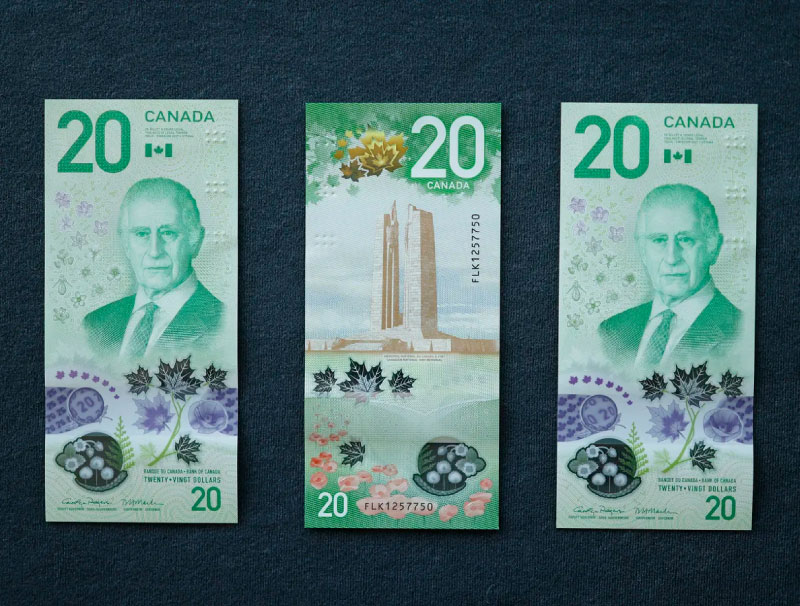
The Bank of Canada this week released their updated $20 note featuring King Charles – the WRONG way around.
This isn’t the first time – in 2018 they launched their vertical $10 note which won the International Bank Note Society award.
But why?
- Vertical bank notes fit perfectly in the palm
- Predominantly this is how cash is handled in an exchange
- A format change like this signals innovation, differentiation and design-thinking – tourists first interaction upon visiting a country is often in withdrawing cash in stations, what does that moment say about a country?Great design isn’t about challenging rules, it is about challenging habits which become norms through repetition over time.Horizontal notes had a place in history – but now not so much.
What 1 norm could you challenge in your category to gain real standout?

Being different by design starts with challenging category norms
We help brands challenge the habits everyone else accepts as normal
Get in touch
Sign up to our building better brands newsletter
Free insights for scaling brands